SLS Week 5 - Hey, it's your day!

Hi! Thank you so much for stopping by today. It's Leslie on the blog today!

I get to scraplift Debbie today! Here is the beautiful layout I get to lift.


So I decided to stick to the original pretty closely. I absolutely love this layout. 

I used the Hooray! collection from Crate Paper.

I used one of the patterned papers from the collection as my background and just turned the paper on it's side so that the stripes are vertical and I used this as a base for the majority of my embellishments.
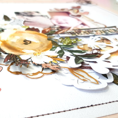
I also used four photo's and stacked them and added a photo strip behind them. 

I have been wanting to make a shaker pocket banner for months now and I thought that this layout would be the best to try it out on. So I took some tracing paper and cut triangles and stitched two of the sides with my sewing machine, then I added some sequins from my stash and stitched the third side closed. 

The rest is pretty self explanatory, I layered some embellishments from the ephemera pack and the chipboard sheet. I also fussy cut the month of March out of the one cut apart sheet form the collection and layered it behind the bottom right of the photo's. I added an arrow below the word March and circled 23, as it's the day of his birthday. 

Lastly I added some enamel balloon shapes around the photo's for some extra interest and texture and also used some Heidi Swapp Black Color Shine to the top right of the photo's and the bottom left.

The stinking cute Aardvark attached to the balloons I fussy cut from a party banner I bought months ago at my local dollar shop. 

And that is it! 

If you are a stickler for Process videos, please click here to watch this layout come together.

Here is the final layout!


Thanks for stopping by today!

Enjoy!

Vienna - Paper Issues challenge

Hello!  

Today I'm sharing this layout that I made for the "As the world turns" challenge. 
I have been wanting to use this beautiful cut file from the shop for a long time, and I finally got my chance. I felt that this globe cut file would be the perfect focal point in a layout, especially for this challenge. 

I did not change the cut file one bit, I used it as is and cut it out of American Crafts textured white card stock. I chose to use the "Auburn Lane" collection from Pink Paislee. I felt that the colours in the collection match the colours in my photo perfectly. I didn't want to change my photo to black and white, the Schnitzel would look like a big grey blob, so I kept it coloured. 

I did a load of fussy cutting as well. I used two of the 12x12 patterned papers and fussy cut some flowers and 4 of the little houses. 

I decided that I wanted some interest on the background, so I splattered some white acrylic paint. I also used a lot of the tiny rub-ons. I love how easily they rubbed on! I scattered the rub-ons haphazardly around the page, I wanted them to look like little sprinkles. 

I popped the cut file and the houses up on some craft foam, to give some added dimension and interest. 

The rest is pretty simple really, I added some of the die cuts from the collection and used the beautiful floral chipboard Thickers for my title, which is simply just "Vienna".

Here are some close ups of the splatters and the rub-ons.


Here is the final layout...


I have a process video for this layout, click here.


Thanks again for stopping by!

Enjoy!!

Thankful for Dubai

Hi, thanks for stopping by!

I used the new Rustic Floral Frame 2 cut file from the store. I  cut the frame out of textured white card stock from American Crafts. I also resized to the file to fill a 12x12 paper. To help the cut file stand put from the background, I loosely doodled around the edge of the cut file with a black pen. 
For the background I was inspired to echo the hexagons in the cut file and I traced a small hexagon shape and stitched in a purple ombre effect, from light purple to dark purple.


For the rest of the embellishing I basically just layered the floral ephemera and the die cuts from the Paige Evans Whimsical collection. 


Thanks you for stopping by today!
If you are a stickler for PV's ( Process videos) please click here

Enjoy!

Paper Issues Challenge - Grid Lock

Hello! It's Leslie on the blog today.
 I'm sharing my take on the Grid Lock challenge. 

I used the "Oh my Heart" collection from Paige Evans. There is a pattern paper from the 12x12 paper pad that has little squares of different patterns. I cut up the squares and used them as my base for my layout. For the back ground I used American White textured card stock, as the white of the card stock goes well with the white used in the collection. We all know how frustrating it can be when the collection and your white card stock are different whites!

I chose to stitch the squares together with an almost messy zig-zag hand stitch. This I did with plain white embroidery thread, I used all 6 strands. here is a close up.


I wanted to use four photos on this layout, so using a grid was very easy, I just placed one little photo in each of the four rows. I also matted the photos with white card stock, just to give them some extra pop. I also decided to pop them up on some foam squares. 

Next, I fussy cut out some of the beautiful florals from the collection and those served as my main embellishments. The layout was so busy with all the patterns and colors in the little squares I did not want to over do it by over embellishing the layout. I added two wood veneer pieces from my stash, The word" Love" serves as part of my title and a little ticket stub sticker serves as the other part of my title, " Beautiful Love".

All in all this layout came together very quickly. Remember if you are in a scrappy rut, make a grid layout, it is easy, effective and striking, and not much thinking goes into it. 

Here are more close ups.


 Here is the final layout. I painted a black ink boarder around the edge of the page to bring it all together. I think that my black border brings out the pops of black in the little squares behind and in the photos. Please remember to use my code LESLIE to get 20% your purchase of you buy at 

For the Process video to this layout please click here.

Favorite Color? Rainbow - JustNick Design Team Assignment

Hi! I had a free choice of cut files this week, so I chose the Tiny Stems Background. I loved the fact that it is so delicate and for me it resembles lace.
 
I have been wanting to use my Felicity Jane Brooke Kit for ages and now I had the chance. I wanted to document a photo of my daughter of when she was 5. when asked what her favorite color was, she would always respond with a dreamy "Rainbow". I decided to make to cut file a full 12x12 page and cut it out on my Silhouette with Bazzill Marshmellow, card stock. I cut it out ones with a blade setting of 4 and a chose the double cut function, but that still did not cut through the paper. So I wasted a perfectly perfect 12x12 sheet of Bazzill Marshmellow. But then I changed the blade setting to 6 and still had it on double cut, and that worked like a charm! The cut file peeled off the mat beautifully!
I layered the cut file over the rainbow paper from Felicity Jane and then I proceeded to embellish. I used some Studio Calico journaling cards for layering behind my photo and some paper from my stash. The rest is all Felicity Jane Brooke and Brie kit embellishments. 
Here are some close ups!

Here is the final layout!
I hope you found this inspirational. You can take a file and use it just like that, as a big 12x12 mat for your photo!
I you would like to watch the Process Video for this layout please click here.
Enjoy!

Favorite - Paper Issues Design Team Assignment

Hi everyone! 
My assignment was "Puttin' on the Glits". 
If you follow me you will know that I usually scrap by collection. I still have to make that shift in my brain that it is okay to mix collections! Weird, I know! But with this layout I made it a mission to do just that, mix collections! I used Pink Paislee Auburn Lane, Crate Paper Flourish and Crate Paper Wild Heart. I got it right to use three collections on one page! That is huge for me you guys! 

I fussy cut flowers from one of the sheets from the 6x8 paper pad and from one of the 12x12 papers from Auburn Lane. Those served as my main embellishments. I also pulled out a 6x8 sheet from the same collection to layer behind my photo. For the rest of the layering I used 6x6 sheets from the Flourish collection. I also used two Vellum ephemera pieces from Flourish, with the swan vellum piece serving as the inspiration for this layout. I love the subtle sketchy and wispy nature of the little piece, and the rose gold would serve as a great 'Glits' addition. 

I also ventured outside the realm of the stark white background and chose a 12x12 patterned paper from Auburn Lane. It too has a very subtle print. So with all my elements carefully chosen the gluing began. 

The main 'Glits' on my layout is the title and the small hearts at the top left hand corner of the photo. These are from the Wild Heart collection, and adds just the right amount of shimmer and sparkle without detracting from the rest of the layout. 

I have scrapped this photo of me and my husband on our 10 year anniversary before, but there are no rules that state that you can only scrap a photo once! I don't journal on all my layouts, but I decided that I needed to tell a story in words as well as pictures. I used my WRMK Typecast and cut the sentences into strips and adhered them next to the photo. 

I felt that the background needed something more, so I splattered some Black Heidi Swapp Color Shine onto the background, I wanted the splatters to resemble ink splatters. 

Compositionally speaking, there are a few aspects to consider. The main area of embellishing runs across the page in a horizontal path, through the middle of the page. The swan Vellum piece is offset just a little above the main line of embellishment, encouraging the eye upwards to the top right hand corner of the page, thus I added the black splatters to the top right hand corner of the page and then to add balance to the page, I added black splatters to the bottom left hand corner of the page. Thus, the splatters adds a diagonal aspect to the composition. The eye is drawn from the top right hand corner down to the bottom left hand corner of the layout. The negative spaces in the top left hand and bottom right hand corners of the page serves as a balance to the diagonal line. Far from being negative spaces, these two spaces keep the composition together. 

Here are a few close ups of my layout...


Here is the final product...


If you, like me, are a stickler for process videos, please click here to watch my process on YouTube.
I hope that you are inspired to add some sparkle and glits to your layouts, don't be afraid slap on the glitter pieces and never skimp on that gold!!!

Enjoy!

Stay wild - JustNick Design Team assignment

Hi everyone.
 My assignment for today was to make a layout to do with Fall or Halloween, and I chose to do a layout about Fall, however, where I grew up we saw Autumn.
I used the Fall Florals cut file.


I filled a whole 12x12 page with the cut file and also resized them, so that I would have different sizes to work with in my layout. I had my Silhouette cut out the florals of Textured White American Crafts Cardstock. To resize the cut files I had to undo the compound path. Then I drew a bounding box around each individual shape and reselected it's compound path. This freed up each shape so that I could move it around individually and resize it as I saw fit. 
I used the new collection from Cat Martin called Norwegian Wood. It is a print and cut collection. 
I basically created a wreath around my 12x12 page with a combination of the cut files and layered the Norwegian Wood embellishments above and below the cut files. And that is that, not much else really, just a lot of layering!! 
If you are a stickler for process video like I am, click here to see the process to this layout on my YouTube channel.
Here are some close ups of my layout...


Here is the final product...


Enjoy!

Let's go! - Leslie Berner

Hi Everyone! It's Leslie on the blog today. I got to make one of my favorite kind of layouts, and that is to use a cut file as my focal point of my page. 

I used the beautiful ' Let's go vacation geo tags' cut file from the Paper Issues shop, and as you all know all these fantastic cut files are for FREEEEE. 

I used the 'Imagine That' girl collection from Eco Park and then added some ' Oh my Heart' from Pink Paislee for the final touches. I used papers from the 6x6 'Imagine That' paper pad to back the letters of the cut file. if you look closely I tried to alternate dark busy patterns with lighter softer patterns, for instance, the 'L' is a darker plaid and the 'E' is a lighter floral print, then the 'T is a soft cloud print that contrast with the vibrant rainbow print I used to back the 'S'. 

I wanted to do some mixed media on this layout, so I busted out my Gelato's and used the Gauva, Bubblegum, Metallic Mint, Metallic Blueberry and Iced Pear to create a watercolor rainbow effect behind my photo. to achieve this effect I used the packaging technique. This is when you take an old piece of plastic packaging, you add your paint or Gelato straight to the plastic, you smoosh it around a little and then you turn the plastic face down unto your layout and proceed to smudge the color of the paint or the Getalo unto the paper. It is a very fun way get organic shapes and lines. It is very easy as well. So if you are scared of mixed media, try this technique. 

I used a lot of layering behind my photo, I used the off cuts from the paper I used to back the cut file as the layering, so nothing goes to waste.

The rest is pretty self explanatory, I embellished with some of the stickers from the 12x12 sticker sheet as well as the 6x12 chipboard sheet. To finish off the final details I pulled out my Paige Evans Sticker Book and chose some elements from the 'Oh my Heart' section as I think that the colors match the Echo Park collection [pretty nicely.

Here are some close ups....


Here is the final layout....


I hope this inspired you to take on the challenge of using a large cut file as a focal point in your page as well as taking a shot at mixed media.

You&Me

Hi! It's Leslie on the blog today, thanks for stopping by!
This week is the beginning of the new month and lots of new challenges and beautiful new cut files!
This  week we have the freedom to choose any cut file from the shop to use in a layout, and I chose the Floral Swag 4 cut file. 


I had my Silhouette cut it out of plain white American Crafts Card stock. I resized the file to a larger and a smaller version. 

I used the Auburn Lane collection from Pink Paislee for this page. 
I layered white card stock on a patterned page from the collection and used my WRMK ( We R Memory Keepers) sewing machine to stitch around the edge of the white card stock. I used a maroon colored thread. 

I decided I wanted to put my photo in the center of the page, and have the main embellishing cluster to the bottom left hand side of my photo. I layered the cut files and the fussy cut flowers to create a full, vibrant cluster. I wanted it to look very full, like a bunch of flowers. I cut the sprigs from one of the cut files off and added them to the cluster for extra detail, and I also cut free some flowers from the same cut file and layered them randomly around and underneath the big cluster.I added a smaller cluster to the top right hand of the photo to balance out the larger cluster. To add some extra color, I tucked some thread nests in behind the cut file.

Here are some close ups...


Here is the final layout...


I love how this layout turned out! I love the detail and whimsy the cut file adds to the floral cluster. 
Enjoy!

Darling love

Hi! It's Leslie on the blog today!

I had to make a layout for Scraplift Sunday week 4 this month. The layout that I had to scraplift is this beauty!


As you can see there is a definite vertical layout and also very obvious horizontal aspects, being the strips laid behind the photo. I love the colorful, playful aspect of this layout. It is so happy and very inspiring!

I went ahead and printed a photo out of my daughter in a beautiful blue sailor styled dress.
I knew I wanted to focus on the blue in the photo. So I pulled out my Crate Paper, Flourish and Wild Heart and selected all the blue bits.

I also did some mixed media in the background, I didn't feel it was necessary to add Gesso to my page, as it was using Bazzill Marshmellow card stock and it is quite a thick and robust card stock and can generally handle mixed media well. So I painted some black stripes very messily across the right hand side of the page, as I knew the bulk of my embellishing would go on that side of the page. In the photo my daughter is looking over to the left, so I wanted her facing and looking towards the center of the page, so I placed my photo on the right hand side. 

The rest is pretty self explanatory, I layered as many of the blue elements I had pulled from the two collections, I also included a tag, and some small journaling spots from a cut apart sheet, I also made use of some of the branding strips that I had been collection from the two collections. 

I went quite embellishment heavy in this layout. I used two of the blue roses from the Flourish embellishment pack and used a lot of gold accents all over my layout. You will see that I applied the rule of thirds when I added the little golden hearts. 

All in all I love the clean look the strips in the background gives but also the softness that the flowers and leaves bring to the mix. 

This was an easy and fun layout to create, I think it is because I had such a beautiful page to lift, but also because I kept the color scheme simple. At times I found myself wanting to add another color, link green, but then I reeled myself in and kept it to the basics. You will find that if you keep your layouts simple and uncomplicated they often become your favorite ones. 

Here are some close-ups:


Here is the final layout.

Enjoy!!


Happy Together

Hi!

My assignment this month for the Paper Issues design Team is Swanky Swatches.


I love these colors! I also love the selection of fruit and the roundness of the fruit. I decided I will take inspiration from the colors, fruit and the circles. The fruit are fresh and summery, so I decided to scrap a photo of my husband and my baby enjoying our water slide in our back yard.

I used the beautiful Pebbles, Jen Hadfield, Patio Party. I love the colors, however, I wanted to tome the colors down a bit to match the muted tones in the swatch. So I added some vellum to the mix. I punched out 2" and 1.5" circles from the pattern paper from the collection, and the vellum. I decided do some stamping on y background with an older Martha Stewart circle stamp. I kept the bulk of the layout to the right hand side of the page. I scattered the stamping and some Heidi Swapp color shine, Butter and Citron to create the background. 

I did print my photo out quite small, as I wanted the layout very light and airy. 
I fussy cut the flowers out from a pattern paper from the collection and used them to frame the photo. The complete the layering of the photo, I used one of the recipe card cut a parts in the 12x12 paper pad and added some vellum. The butterflies I scattered around the photo can be found in the ephemera pack. You will see that I used the vellum to layer over the patterned paper circles. I used brads form my stash to attach some of the circles to the paper. 

I usually tend to place the titles of my layouts below my photo, but I thought I would spice things up and place my title above the photo. 

Here are some close ups... 


Hope this beautiful Swatch inspires you to create!!!!

Here is the link to the process video for this layout!

Enjoy!